
Have you ever looked at pictures of people from the 1990s and wondered, “what the heck are they wearing?” I think most of us have. Because fashion trends come and go (and 90s fashion is ridiculous!), right?
Well, it’s no different with web design trends. As time goes on, new trends make their way into the picture. And as those new trends roll in, we end up with outdated web design trends that need to make their exit. Only with web design, the process happens about 10x faster than clothing!
This post is focused on those trends – the outdated web design trends that need a good kick to the curb if you want your designs to appeal to visitors.
1. Image Carousels
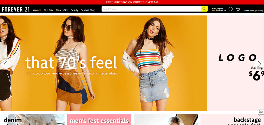
Thankfully, carousels are nowhere near as common as they once were. But you still see them pop up fairly regularly despite carousels having a contingent of detractors who feel strongly enough about the issue to actually create an entire website mocking carousel use.
So why are carousels so bad? Mainly because no one clicks on them and they make it hard for users to find content. While carousels with CTAs are at least marginally better than those without, they’re still typically a waste of space.
There’s tons of data that backs this up:
- Erik Runyon found that only 1% of people clicked on ND.edu’s carousel. With most of those clicks going to the first slide.
- Nielsen Norman Group found that, even when a user was looking for a specific piece of content, they couldn’t find it because of an auto-forwarding carousel.
- Wider Funnel found that carousels just plain don’t convert.
They’re distracting, confuse users, and don’t convert. And for those reasons, carousels are a bad design decision for the vast majority of websites.
2. Parallax Scrolling for Everything
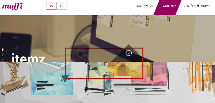
Parallax scrolling is one of those things that is great in the hands of professionals but should never have been made accessible to anyone else.
Whereas it was once used tastefully to enhance designs and add depth, now it’s a standard feature of most WordPress themes. And that means it gets abused.
So when is parallax a good idea? A study in the Journal of Usability Studies found that users find a site with parallax to be “more fun,” which makes parallax ideal for lighter websites.
But at the same time, some participants in the study experienced “significant usability issues” as a result of motion sickness.
Parallax doesn’t need to completely go away, but it does require a healthy dose of restraint.
3. Obvious Stock Photos
Look, there are certainly times when you need to use a stock photo. It’s not a blanket “all stock photos are bad”. But you know what I’m talking about…
That photo of the woman with the headset that’s on 50% of websites’ “help” pages? Yeah, that’s an outdated design trend. Do you really think visitors believe the same woman works at 500,000 different companies?

Okay, maybe that’s a bit hyperbolic. But if you’re going to use stock photos in your designs, make sure that:
- They’re high quality.
- They really are the only option.
4. Overly Aggressive Popups
I wish this one were less popular than it is. But despite Google clamping down on annoying popups on mobile, popups are still unfortunately a feature of many websites, especially if you ever take a jaunt around the Internet marketing space.
So why has this design trend persisted for so long? Part of it is an unfortunate focus on conversion optimization. Webmasters think that throwing on pop ups will get more email subscribers. And while that may be true for a bit. The end result is that their site looks horrible and gives visitors an even more horrible user experience.
So if you want to focus on creating a site people actually enjoy using, kick overly aggressive popups to the curb and find another way to build your list or sell products.
5. Hamburger Icons on Desktop Sites
Hamburger icons make sense on mobile sites. There’s limited space so you need a universal way to indicate to visitors where the menu is. Totally fine with that.
But why are some desktop designs adopting the same hamburger icon for menus? Hiding navigation menus does not make your website more usable. Is it driven out of a misplaced desire for minimalism?
Instead. forcing your visitors to click an icon just to open your menu adds unnecessary friction to your site.
And for that reason, you’re usually better off kicking this one to the curb and displaying your top-level navigation right away.
6. Missing Form Labels. AKA Minimalism for Minimalism’s Sake
When you design a site, your end goal should never be just to create a minimalist site for the sake of…having a minimalist site.
Instead of striving for minimalism, strive for simplicity. Simple sites are all about streamlining design to reduce friction. But that doesn’t mean they’re inherently minimalist.
Where does minimalism for minimalism’s sake usually rear its ugly head?
In a misguided march towards minimalist design, some web designers do things like eliminating form labels. And while that might make for a slick, minimalist design, it also causes all sorts of issues for visitors.
7. Too Many Sidebars or Widgets
One of the great things about WordPress is how easy it is to add widgets and sidebars to your site. But thanks, perhaps in part, to that ease, some designers get a little too widget happy.
A widget for this, a widget for that…it adds up quickly. Trust me, I know because I was guilty of this at one point.
So repeat it after me – just because the widgets are available, that doesn’t mean you need to use them. Adding too many widgets clutters up your pages, which is why you should focus on keeping widgets to the real essentials.
8. Too Many Fonts for No Reason
There are a lot of brilliant designers out there creating beautiful fonts. Which means that when it comes time to design a site, it’s easy to feel like a kid in a candy shop. But just because a font is beautiful, doesn’t mean it deserves a spot on your site.
If matched properly, 2-3 different fonts can enhance your design. But if you start going past three, you’re just going to make your site confusing and hard to follow.
You can find some sites using more than three fonts well, but most of the time, it’s going to hurt, rather than help, your designs.
Wrapping Up
Hopefully, this post soon won’t make sense as these outdated web design trends fall out of the public consciousness. But until then, we’re stuck with them, even if it’s only a small percentage of websites.
Now over to you – what’s your biggest web design pet peeve that you wish would get kicked to the curb?